I sometimes
wonder what goes through a paint manufacturer’s mind when they name their
products.
There was a time
when just a simple black, white or blue would do. Not any more; these days, no
shade name is complete without a spoonful of pretentiousness.
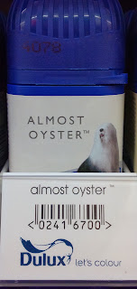
Take this one, for
example:
They may as well
have referred to it as 'Not Pink'.
Some of Dulux’s other
products are just as nonspecific:
That one’s less of a colour, more a concept. It’s a
brave move defining paint not by its tone, but emotional state.
In a similar vein, there's this:
There are many
things that have made me feel uptight. None of them were teal. If anything, I’ve
always found it pretty nondescript.
Or this:
I suspect that someone at Dulux Head Office got a little carried away with their alliteration.
There are plenty more that I could cover, but I won't; there's only so many paint pot pictures that a person can put up with (now who's alliterating?). Of all the obscure monikers spotted on the paint aisle, my favourite has to be this:
I can understand admiring a flower for its petals, but when would you remark on the freshness of its stem? Different strokes for different folks, I guess.


